Overview
There's a problem
Coordinating a multi-destination trip with others presents challenges, including aligning with everyone's budget, maintaining group cohesion, and selecting suitable destinations.
Our solution: Gogo is an innovative app designed to streamline the entire trip-planning process, ensuring efficiency and convenience for travelers.
My Role: I contributed primarily to the development of the home screen, the budget analysis feature, brand identity, and conducting initial research, which helped bring validation to our project
Contribution
Research, Ideation, App Design, Brand Identity
Team
Melody Yu, Sunjoo Park, Sua Kim, Jenny Park
Timeline
June 2022 - August 2022 (3 months)
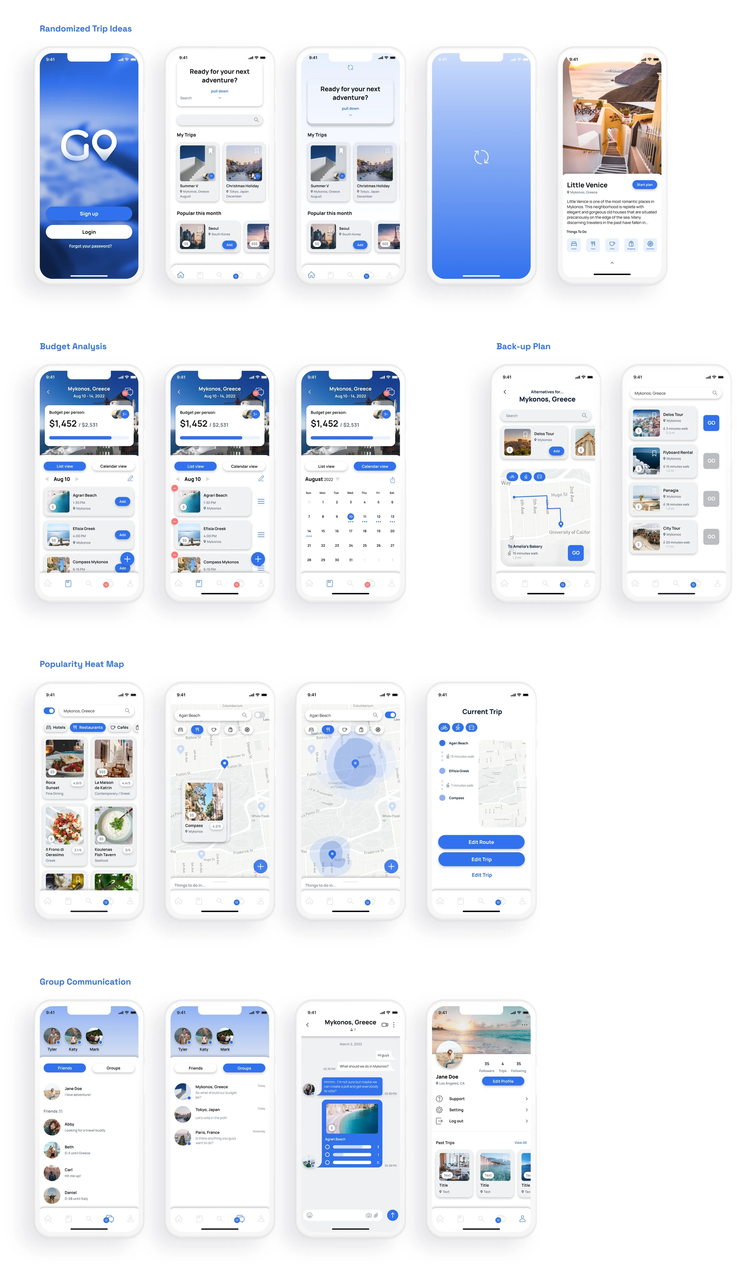
Meet GoGo
What are the main features?
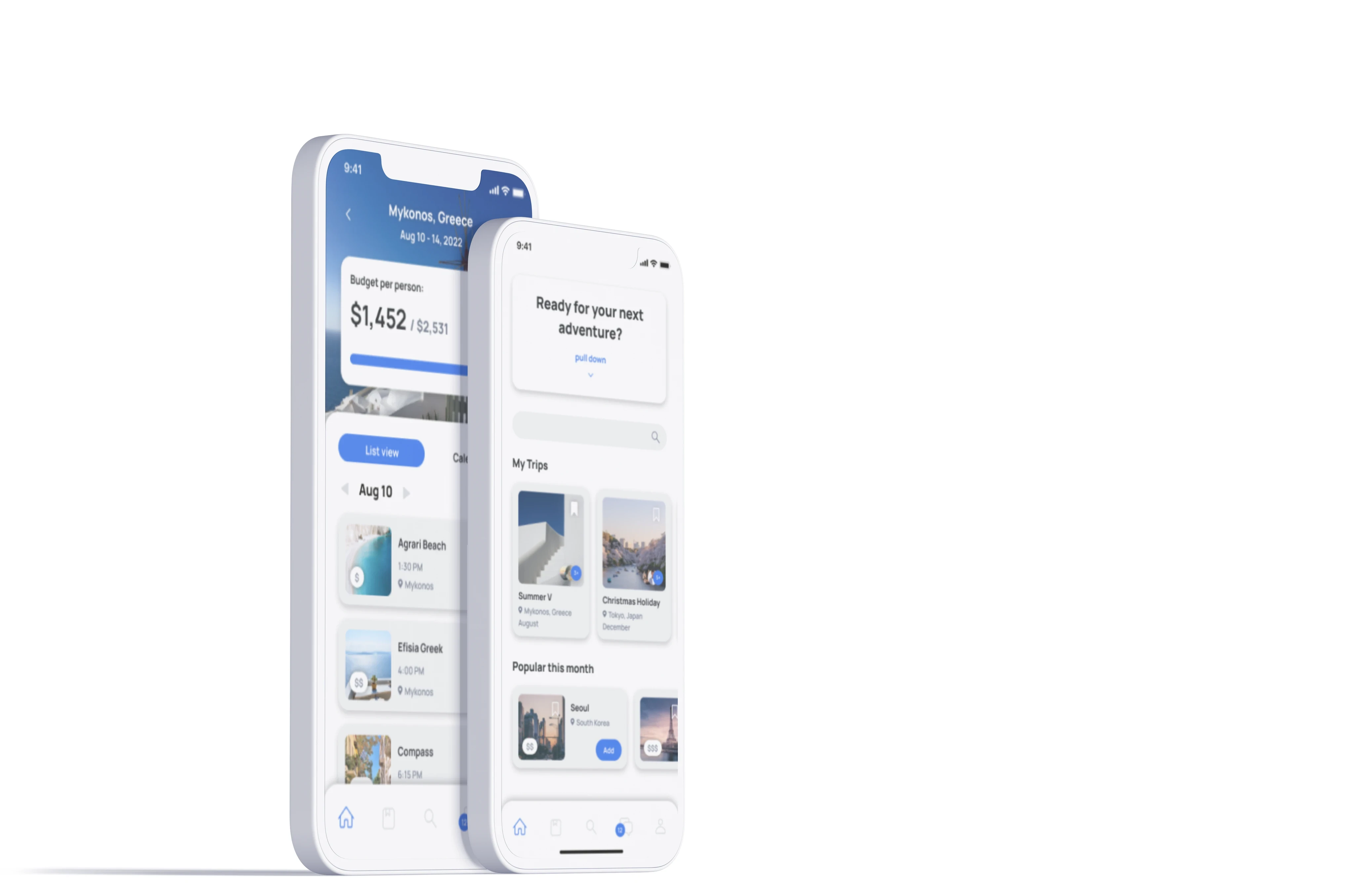
Displayed prominently at the forefront of the trip, GoGo presents the remaining spending balance, along with suggesting new activities within the budget if the original plan is unavailable.
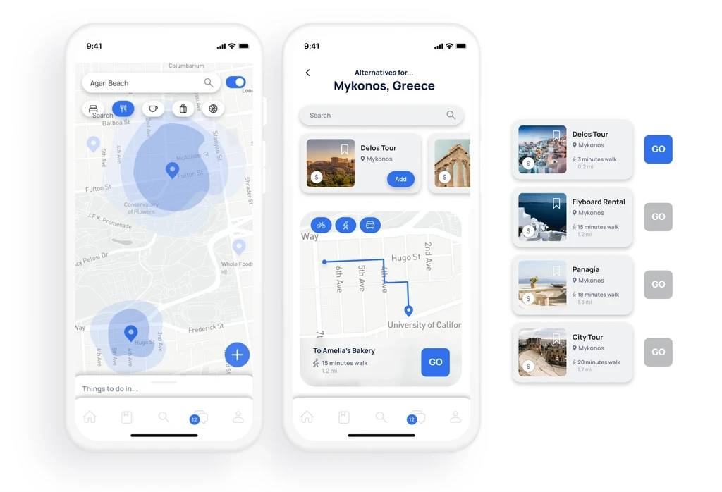
For sudden changes, GoGo offers alternative plans within the budget, ensuring flexibility and adaptability to unforeseen circumstances.
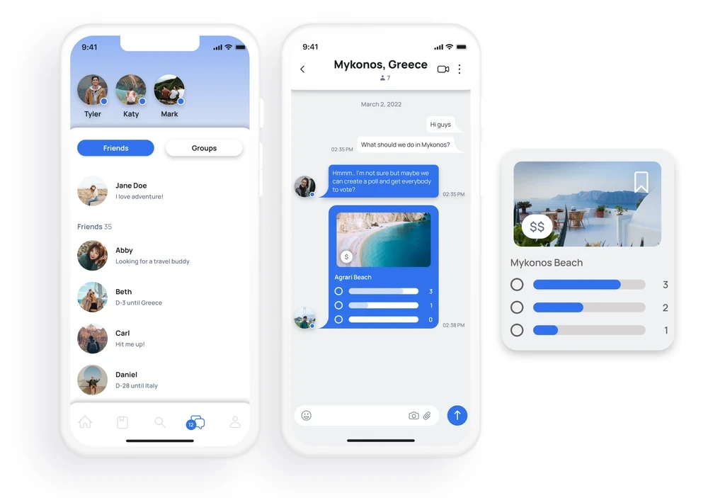
GoGo's chat feature enables communication among friends or travel groups, facilitating coordination and planning for the upcoming trip.
Problem Space
How did we come into this problem space and understand the design implications?
Preliminary Research
Interviewees shared their struggles with disorganized travel planning
To better understand the scope of the problem, we conducted a preliminary survey among 70 individuals after recognizing trip planning challenges. From the responses, I identified three common issues. Over 50 of the respondents highlighted three reoccurring challenges.
These findings served as a crucial foundation for our project, guiding our focus towards addressing these prevalent challenges through our design approach for the GoGo project.


At the end
We decided GoGo would be best as an app
Research Methods
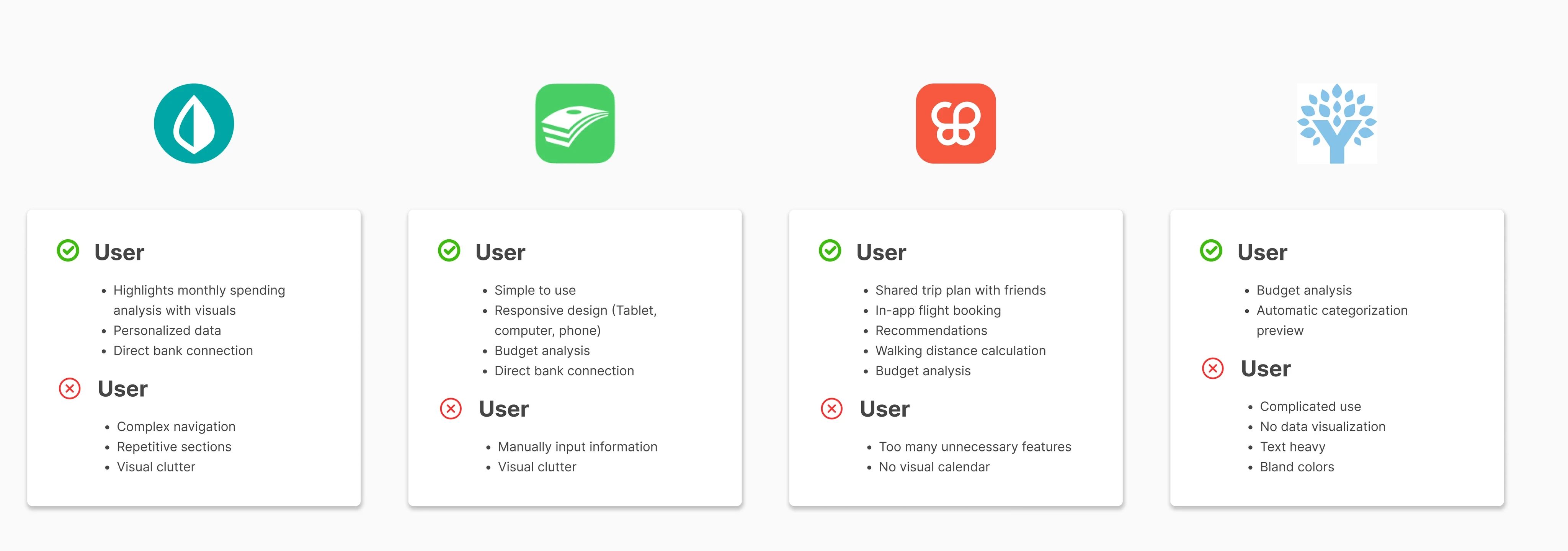
As we began delving into insights and validating our design hypotheses, I observed that existing apps didn't adequately display both the itinerary and budgeting information simultaneously. Recognizing this oversight, I realized there was an opportunity for GoGo to stand out within the market.
Through competitive analysis, it became apparent that current market apps were not user-friendly, characterized by complex navigation and lacking in user-friendliness. This insight further reinforced the importance of GoGo's user-centered approach to design.
The discovery served as an opportunity for GoGo to stand out within the market.
Let's do this
How can we design a tool that helps travelers plan a multi-destination tour within their budget?
Ideation
Focusing on our users
Using all the insights and feedback received, wireframes and digital designs started. Brand development with mood boards took place and personas were created to provide constant guidance and ensure the needs and preferences of our users were met.


Design Refinement
From wireframes to final designs
The first prototype comprised wireframes, which led to too many pages dedicated to various features. A second round of user feedback revealed the potential for better integration of certain features. Additionally, latent needs emerged during the design phase, prompting further refinement efforts.
Solution Context
Homepage + Popularity Map
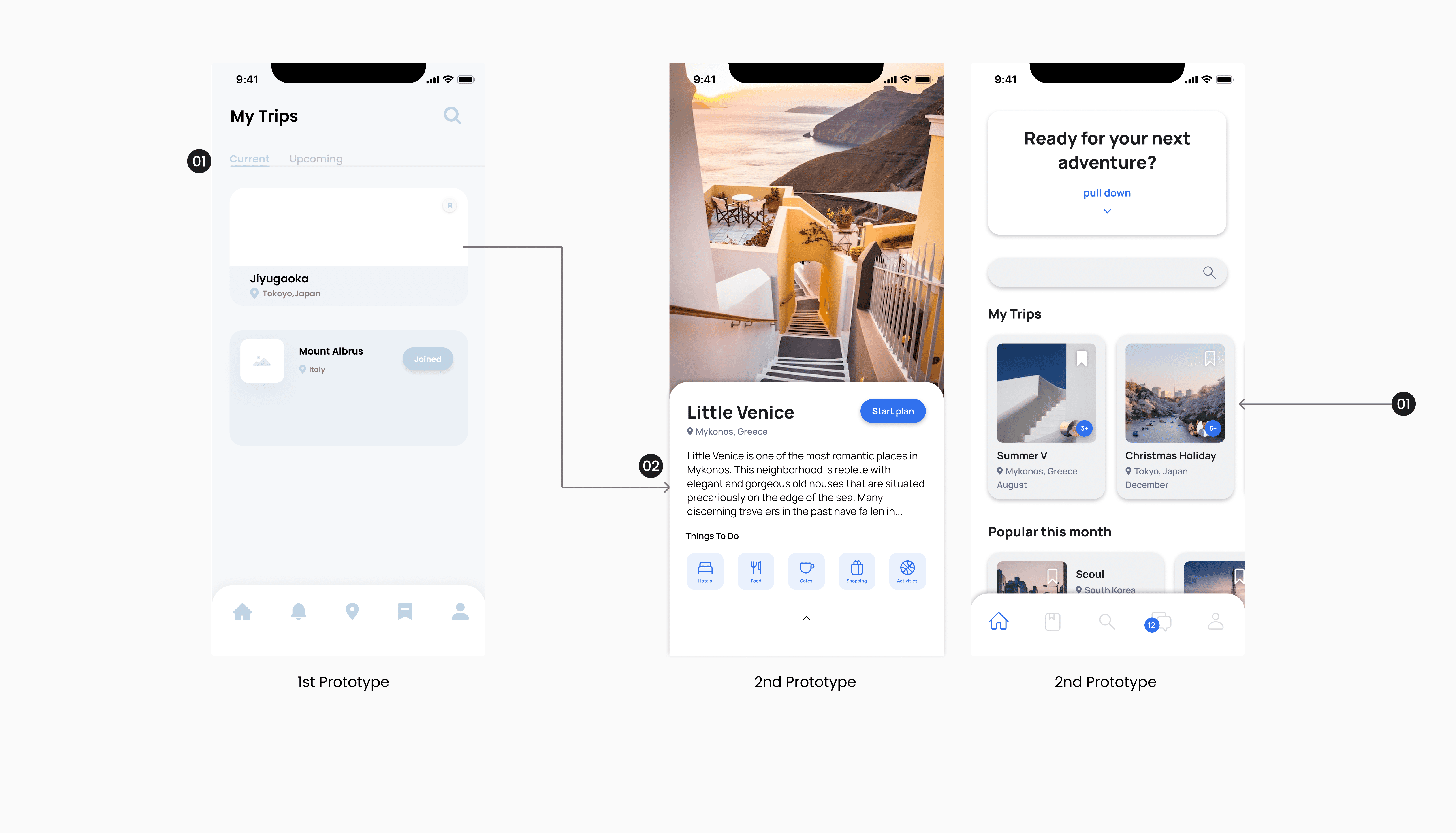
Travel Suggestions underwent significant enhancements. "My Schedule" was rebranded to "My Trips," increasing its prominence on the home screen
Additionally, ratings for places transitioned into a more visually interactive popularity heat map
To optimize space utilization, Suggestions were streamlined into "Popular this month" and a new feature, Randomized trips


Solution Context
Dynamic Budget Page
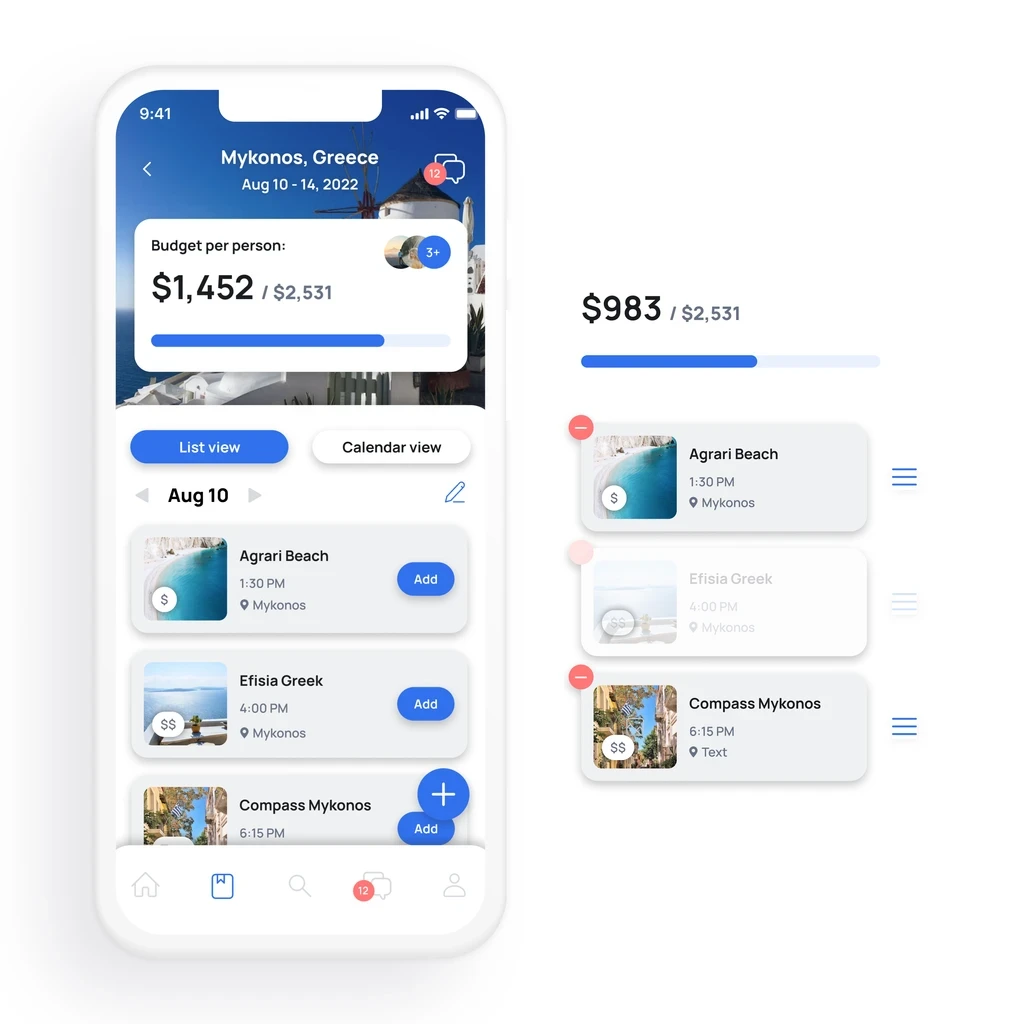
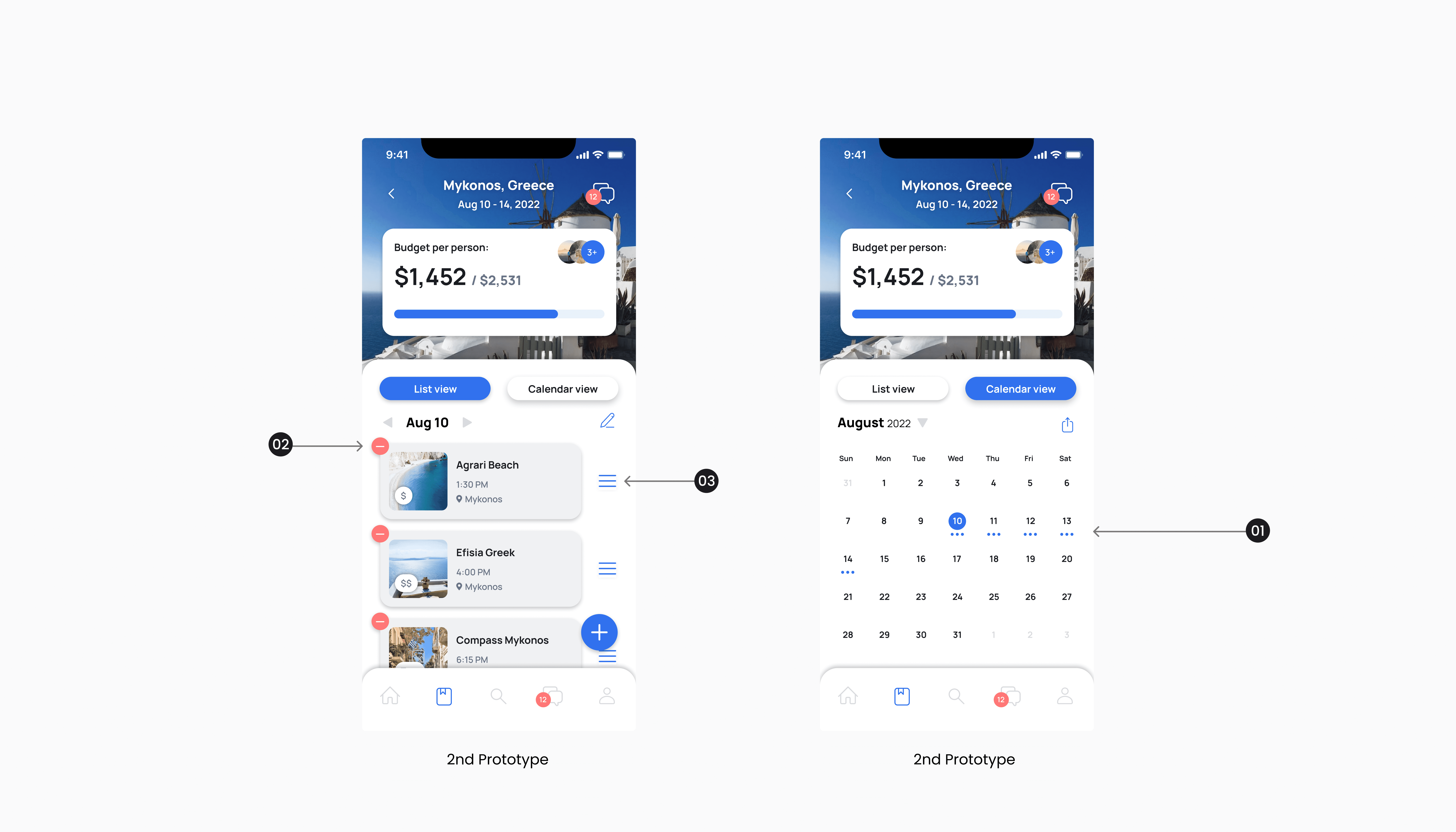
Prioritizing addressing the primary struggle identified by users: budget management. Thus, the budget section was placed at the top of the Trip Page and introduced a visually informative bar to depict available funds
Communication in prototype 1 transitioned from viewing friends individually for each trip destination to a centralized group chat with a shared itinerary plan, aiming to simplify coordination and enhance usability for users managing multiple trips
Solution Context
Concise Trip Page Nav
Refinement of the Trip Page involved integrating the My Trips section into the homepage to reduce excessive page navigation
A new page was created featuring detailed designs of each destination, accompanied by a list of suggested activities to fulfill a latent need identified through interviews, where users prefer choosing activities rather than brainstorming themselves
Solution Context
A Visual Planner
Introduced Calendar view alongside the existing list view for enhanced trip visualization
Integrated the capability to remove events directly on the Budget page, providing real-time updates without additional navigation
Implemented the option to reorder events directly within the Budget page for improved organization and efficiency
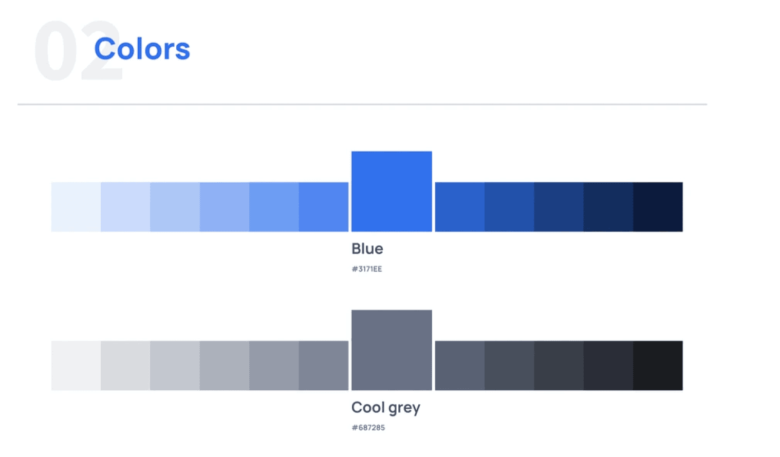
Brand Identity
Fun fact: It took us 4 rounds of voting to choose this blue


Final Screens
Introducing GoGo