
Impact: Standardized visual design for in-page product announcements across all 4 Docker products.
Role: I led and designed a new design standard and integrated it into Docker’s design system for cohesive product announcements.
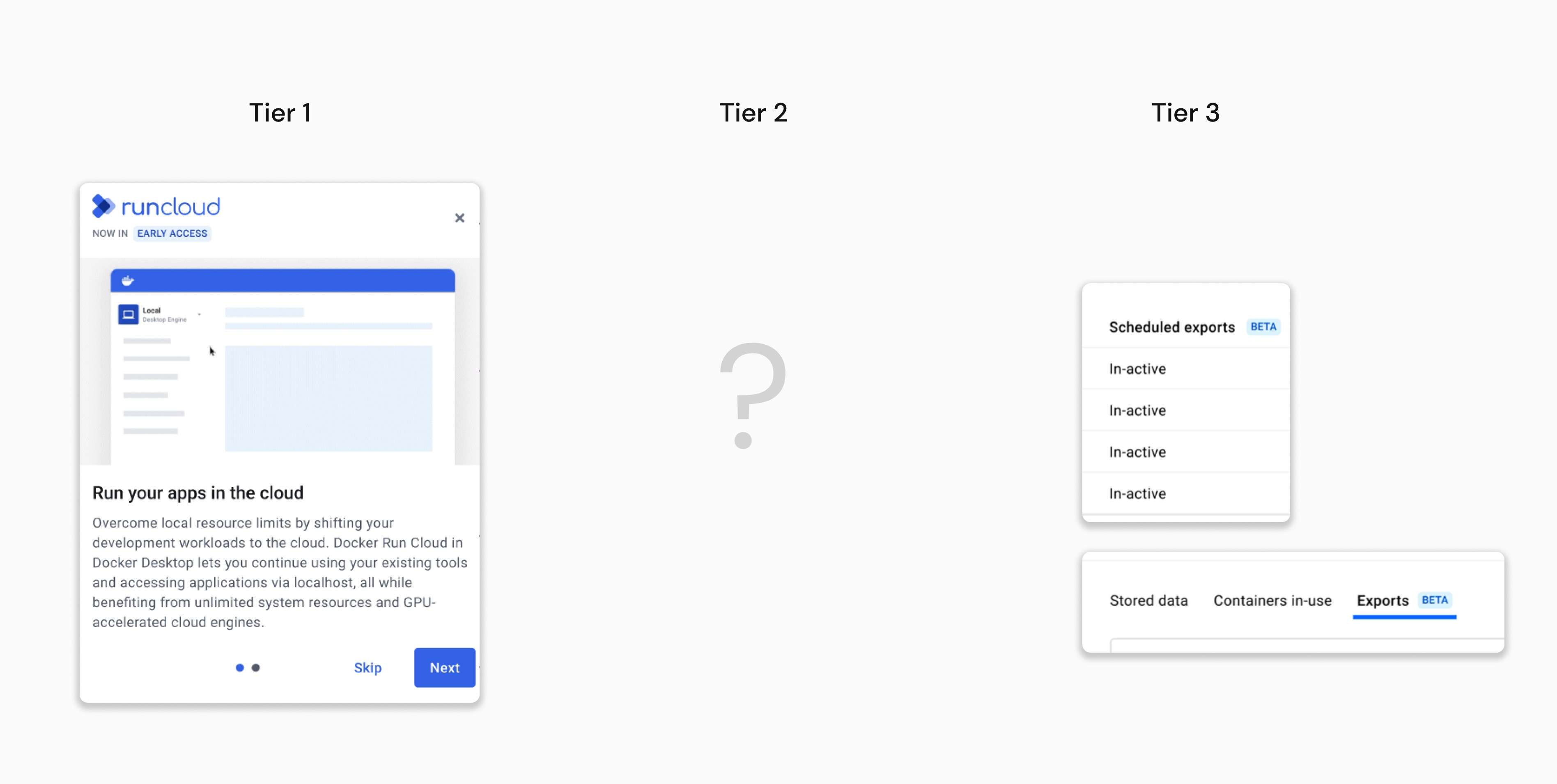
Tier 2 feature announcements are not consistent.
Docker has standardized Tier 1 and Tier 3 product announcements, but not Tier 2 announcements, leading to inconsistent feature rollouts across Docker's four products. Users felt they were engaging with separate tools rather than a cohesive suite. It also created challenges for designers and product managers, resulting in mismatched styles and too many notifications.
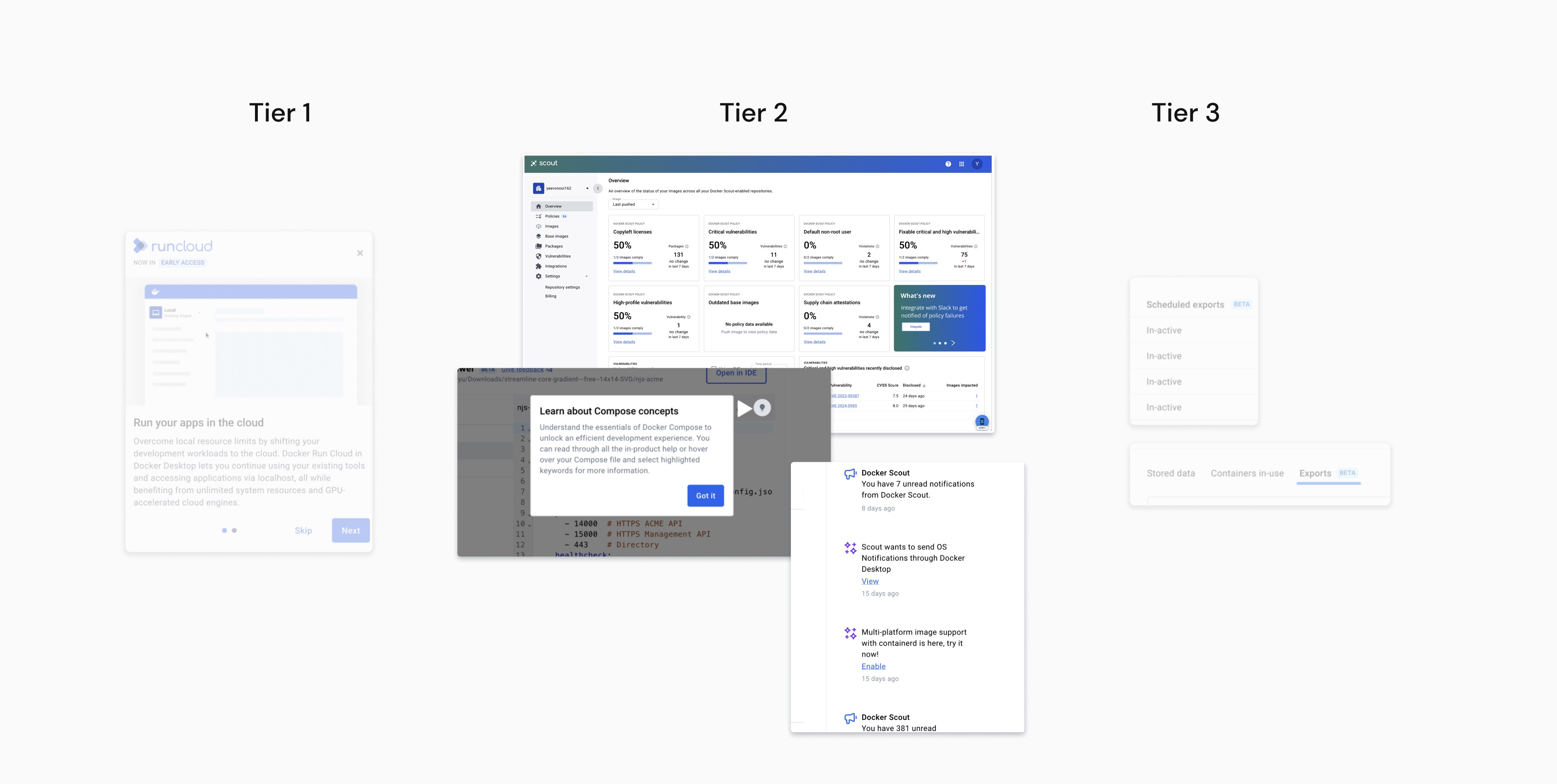
We didn't have this in our design system.
My objectives were to
1. Create a pattern that would work across all 4 Docker products.
2. Draw attention to new features on the page.
3. Align Tier 2 pattern with the style and tone of Tier 1 and Tier 3 announcements.
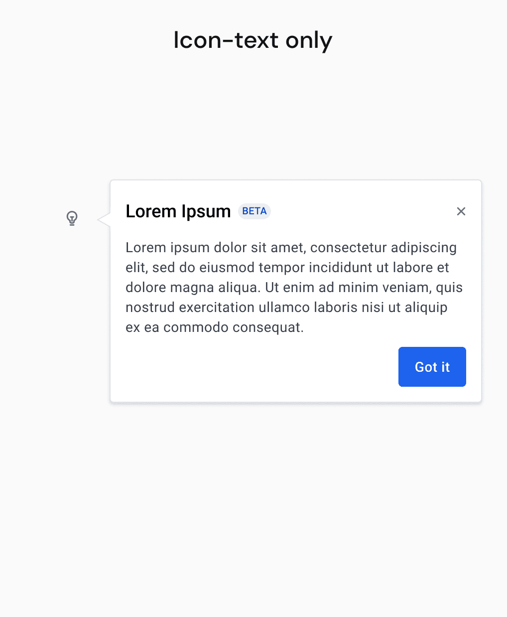
✨ The Breakthrough: Why tooltips worked so well.
Why each design succeeded or failed
Initially, I explored various ways to integrate product announcements into existing features across Docker products. I considered different approaches, but most were not effective. However, I found that using tooltips worked well across all products.


How do different users interact with tooltips?
Once I identified tooltips as the best method for tier 2 announcements, I documented how different user groups interacted them. This analysis revealed that users valued having control over their experience—some wanted to dismiss announcements quickly, while others preferred to read the details.

How this was a more tailored design
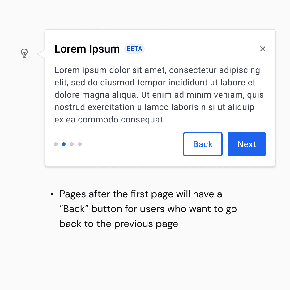
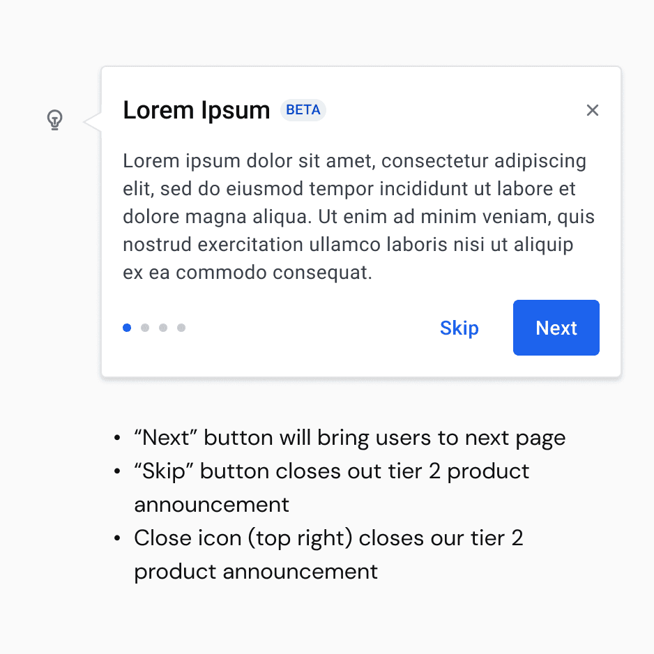
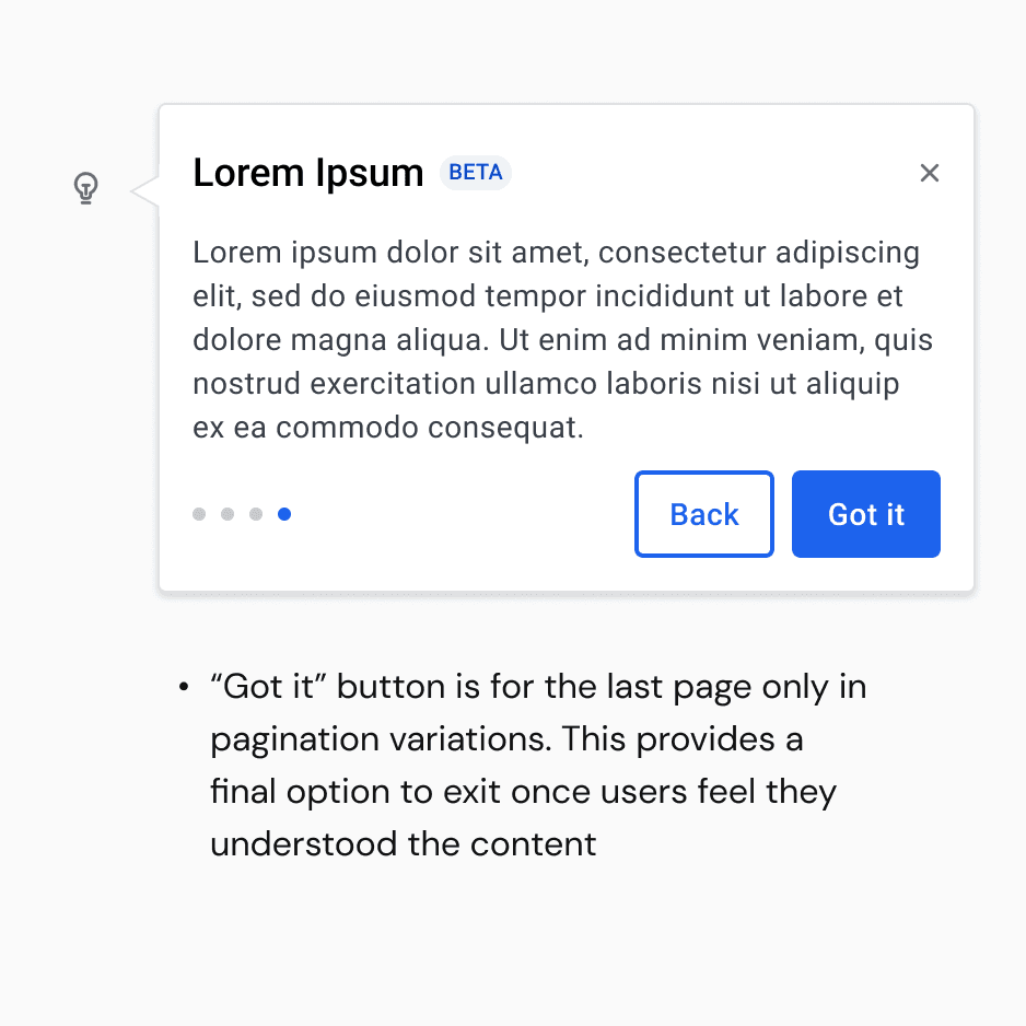
For the final pattern, I merged the Tier 3 announcement (beta chip) to create better announcement visibility. The tooltip had two actions: an "X" for immediate closure and a "Got it" for reinforcing the message.
Why It Worked: This design addresses different user preferences which provides a versatile experience by allowing choices in how to engage with the content.

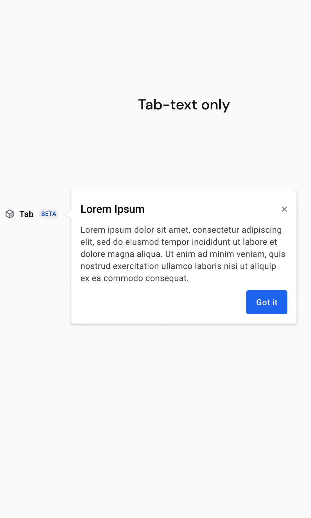
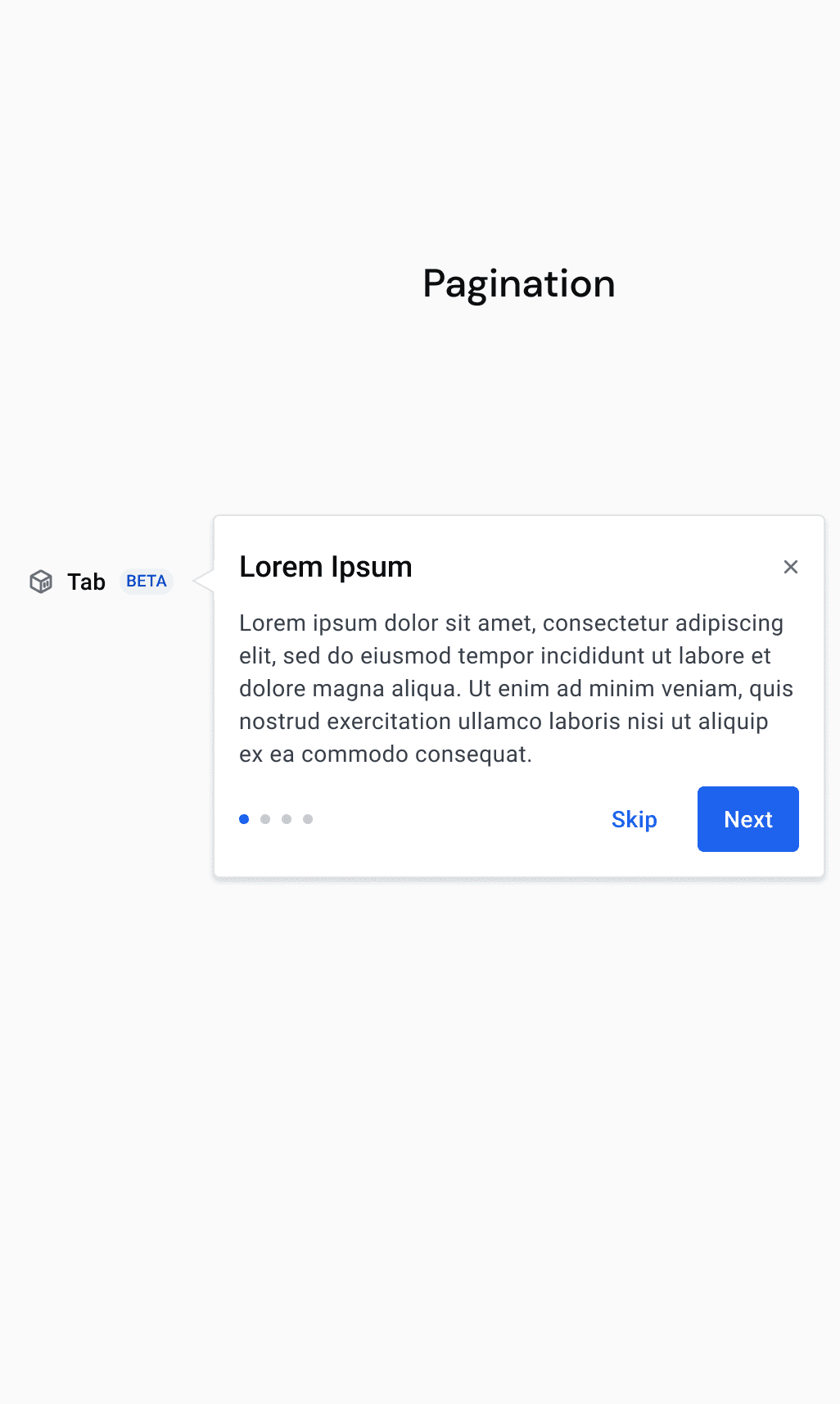
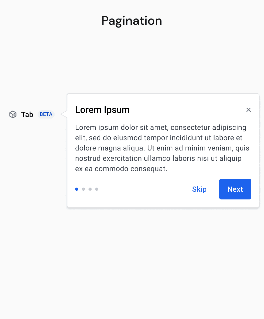
Patterns for different scenarios
I developed four variations to cover different scenarios Docker might encounter with in-page product announcements. Each variation was tailored to specific use cases, including announcements through an icon, via the side navigation bar, multi-page, and with animations.


Getting this into Docker's design system
I developed four variations to cover different scenarios Docker might encounter with in-page product announcements. Each variation was tailored to specific use cases, including announcements through an icon, via the side navigation bar, multi-page, and with animations.

Sky’s the limit—draw inspiration from diverse sources and keep pushing boundaries.
Repetition can be purposeful—can serve as a strategic function.